Informative, fast, simple, privacy preserving and modern. It puts all other loyalty hotel or airline loyalty programs to shame. I'm reviewing the design of the loyalty program signup page and not the loyalty program.
Why is it the best?
Take a look at the screenshot below.
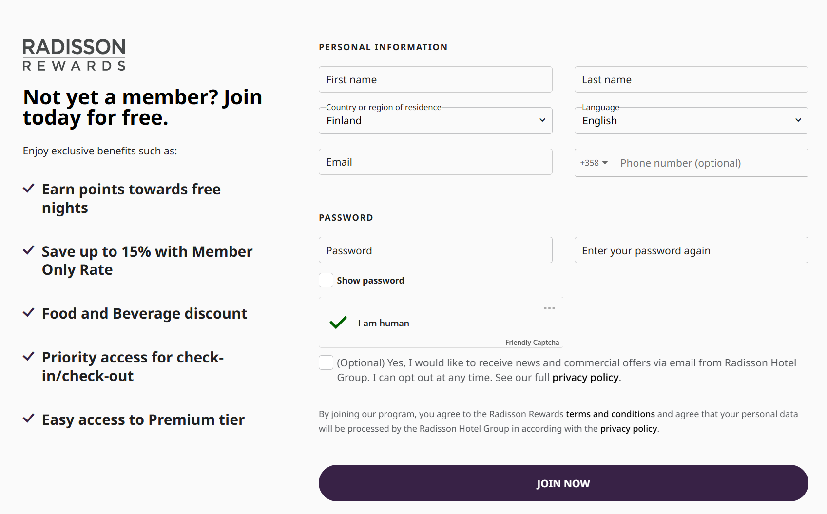
- Web friendly experience: the benefits and signup form fit on a single page, There is not need to go through many other pages or having to go too deep unlike Korean Air's SkyPass. Although I do not like their SkyPass site design, I do love their SkyPass program.
- Fast and easy to complete
- Prepopulated with known information
- Country or region of residence: auto-detected and selected for you based on your IP address. No need to manually choose from a drop-down of 200+ options.
- Phone country code: Automatically selected based on the country or region of residence value. Again, no need to manually select from a drop-down of 200+ options.
- Only asks for pertinent information
- Phone number is optional: Finally, a company that has accepted customers hate junk calls in this day and age, and SMS based authentication codes are insecure, so there is really no good reason to collect the phone number. This also virtually eliminates phishing over the phone.
- Email is opt-in: The European standard. Not the US opt-out system that US Marketing loves because they want to shove emails into your mailbox daily.
While some of you may point out the airline needs your mailing address to mail you your membership card or elite flyer tag, I think it's better to preserve privacy and reduce environmental waste.
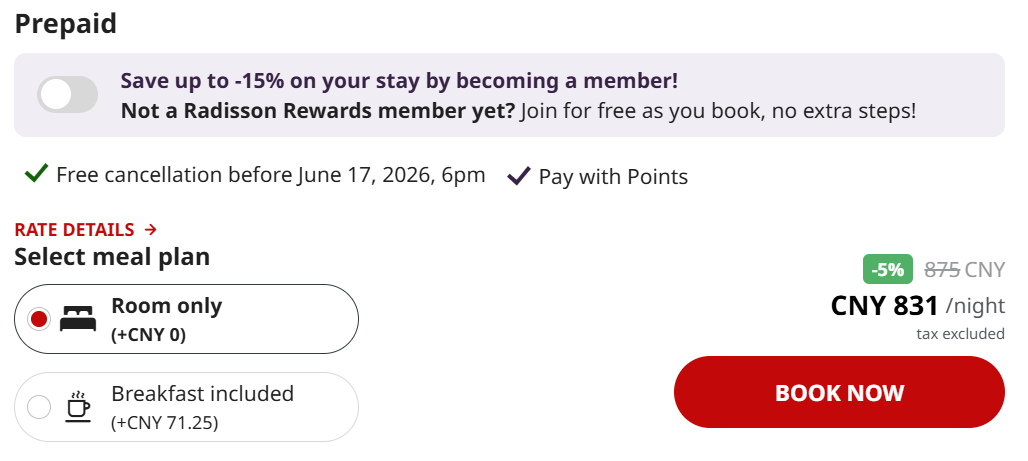
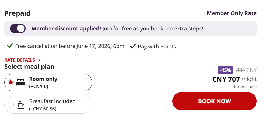
Signup as you go? No problem
Radisson once again is able to clearly articulate the value of membership by showing you the price if you join as a member. It also reminds you how easy it is to join.
I also like their use of a simple Room only or Breakfast included button. If you book a room with Marriott you'll know it's like doomscrolling to find the right rate.
Discussion