Microsoft: Fix your Color palettes
Consistent color use is important in branding, as well as for any output that you - as an end user - is producing. Why hasn't Microsoft fixed this yet?
Short version: color options range from 6 to 30.
Is it also that hard to have a consistent pen thickness UI?
Paint - 20 colors to choose from
Photos - 16 colors to choose from
Snipping Tool - 30 colors to choose from
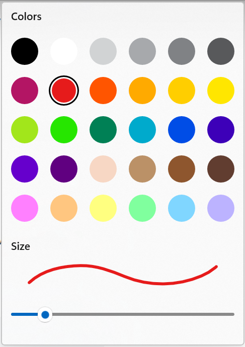
Edge - 30, 6 or 16 colors
You have to wonder if it's 3 different product managers working on this. This is just plain sloppy to have so many differences in the same product.
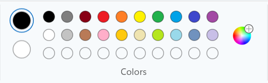
Variation 1 and 2:
- Right-click on webpage and select Screenshot
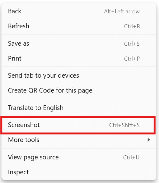
- Select Capture area, then Markup capture.


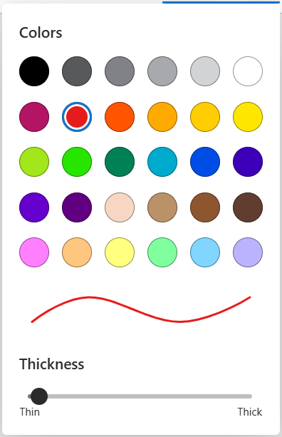
- 30 colors.
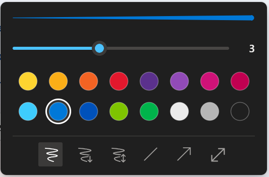
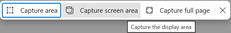
- Repeat step 1, but this time select Capture screen area in step 2.
Accessibility could also be improved.
- cannot use keyboard to move the blue rectangle selection to the other options; mouse or touch only.
6 colors now?
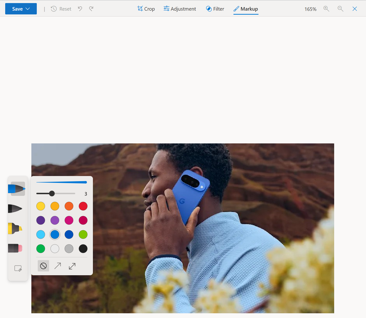
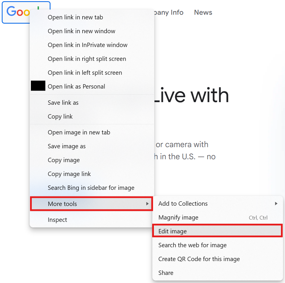
Variation 3:
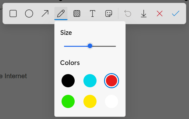
- Right-click on image on webpage, select More tools, then Edit image.
- Click on Markup, then select a pen type to see the colors. 16 colors and inconsistent thickness selector.