Hotels.com site review
I'll be sharing what I like and don't like about the hotels.com site in this post from a product management perspective. See my thoughts on the hotel.com rewards program.
- Is displaying taxes and fees really the product differentiator? This is a feature, not a product differentiator. Other sites provide toggles on displaying prices including or excluding taxes and fees, or allow users to personalize their settings.

- A pop-up displaying the above. Pop-ups are so 1990s, which was when hotels.com was founded.
- Simplify the rewards program page. How about a summarized table like the one below so a customer doesn't have to click and read every single benefit?
| Benefit | Member | Silver | Gold | |
|---|---|---|---|---|
| Nights ("Stamps") | 0 to 9 | 10 | 30 | |
| Price savings | Member Price | 15%+ | 20%+ | |
| Reward Nights | Yes | Yes | Yes | |
| Price Guarantee Plus | - | Yes | Yes | |
| Priority Customer Service | - | Yes | Yes | |
| At VIP properties only | - | Breakfast, Wifi, or spa voucher | Breakfast, Wifi, or spa voucher | |
| - | - | Free room upgrade |
This is what the website looks like.
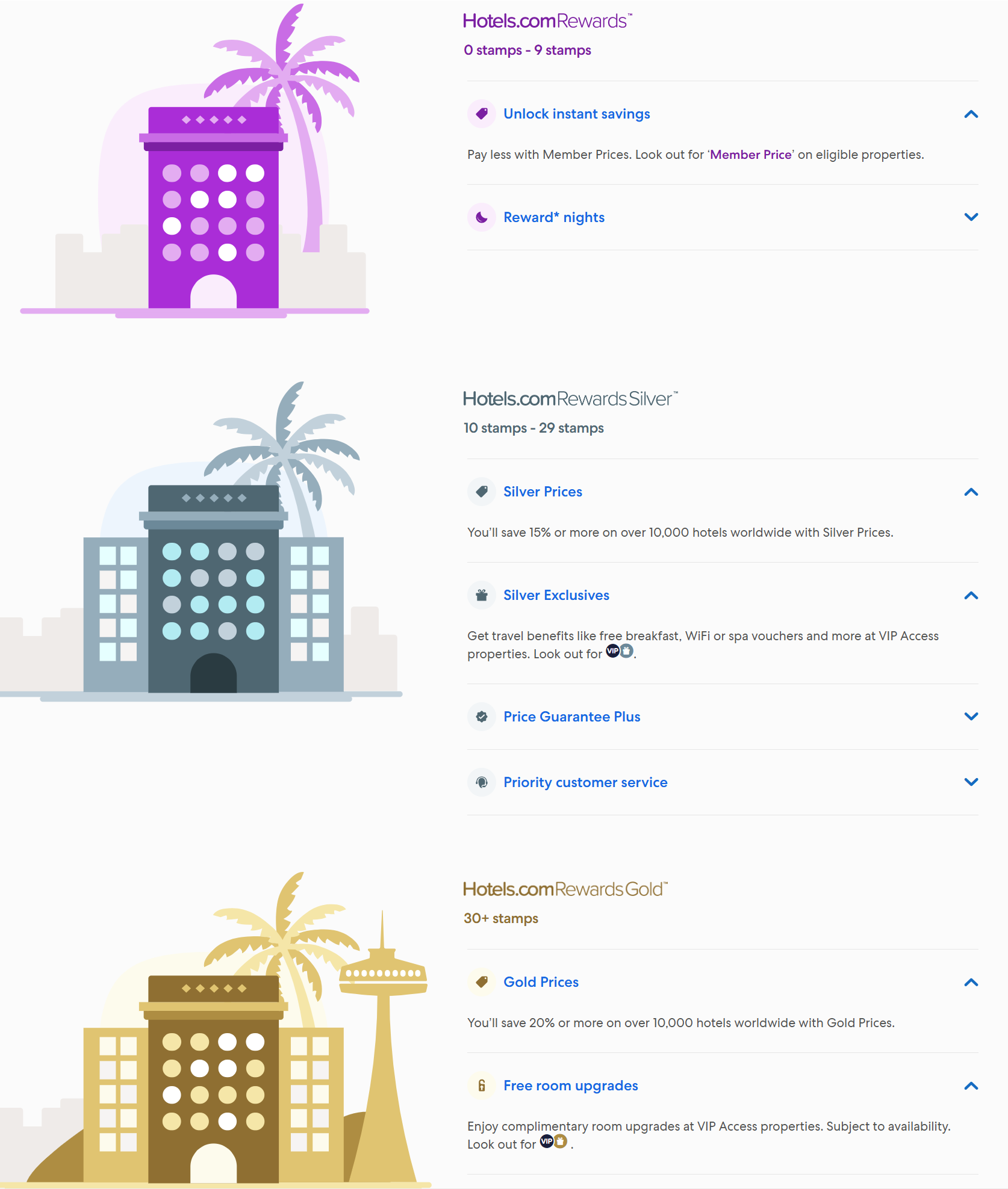
- Succinct benefit explanations (image above). This I like, despite requiring a click on the drop-down to understand details.
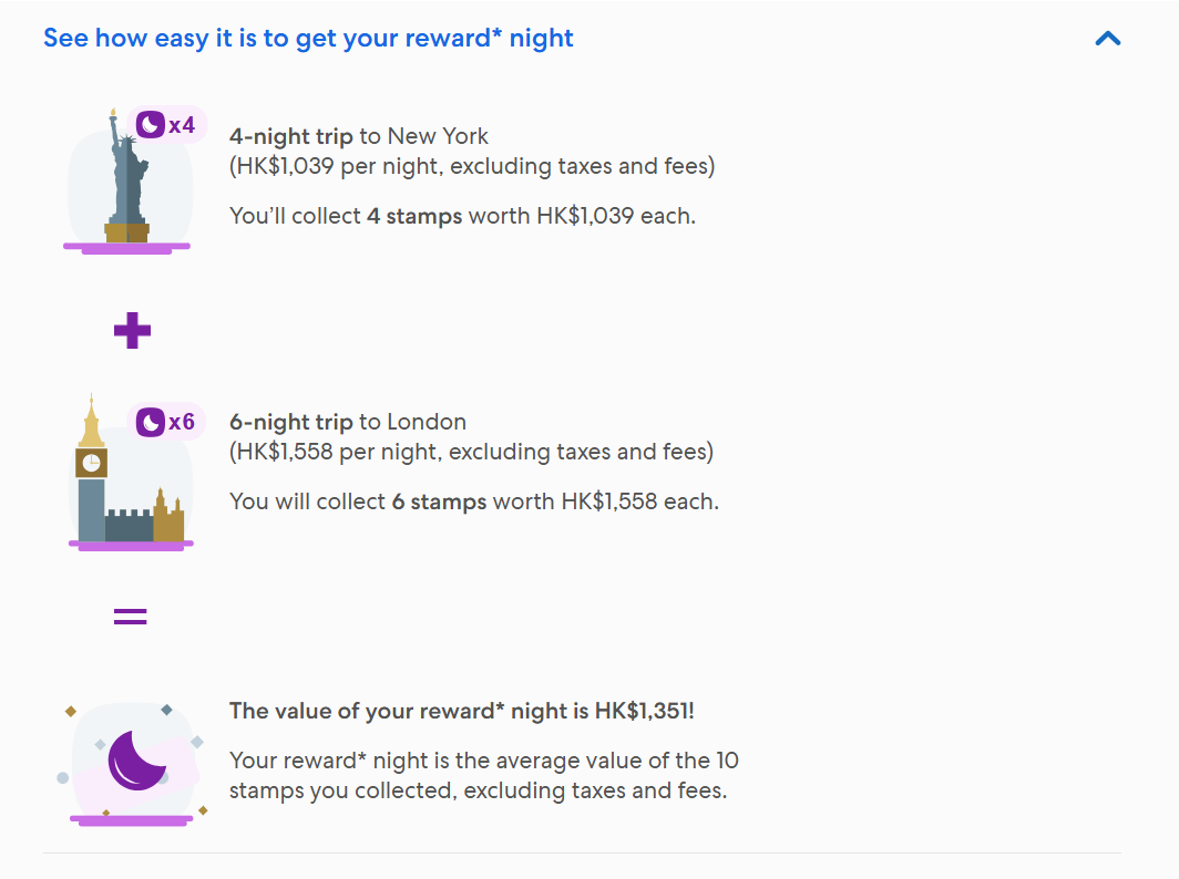
- Benefits example. Relating real-life examples are good.
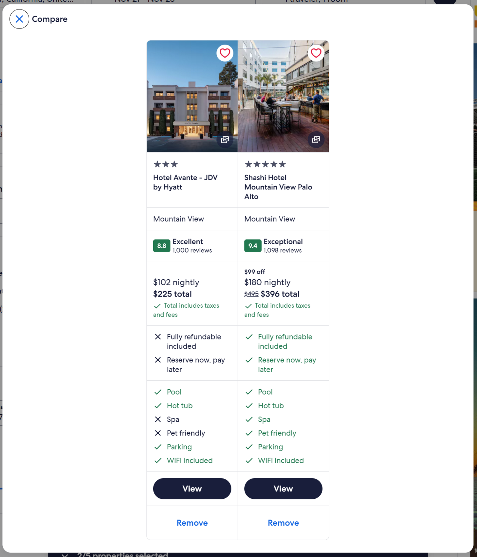
- Hotel comparison tool. This is a real "click" saver, especially if viewing hotel pictures is important in your hotel decision choice, and you don't want to hunt through tabs. I'm surprised this isn't more mimicked on other sites.
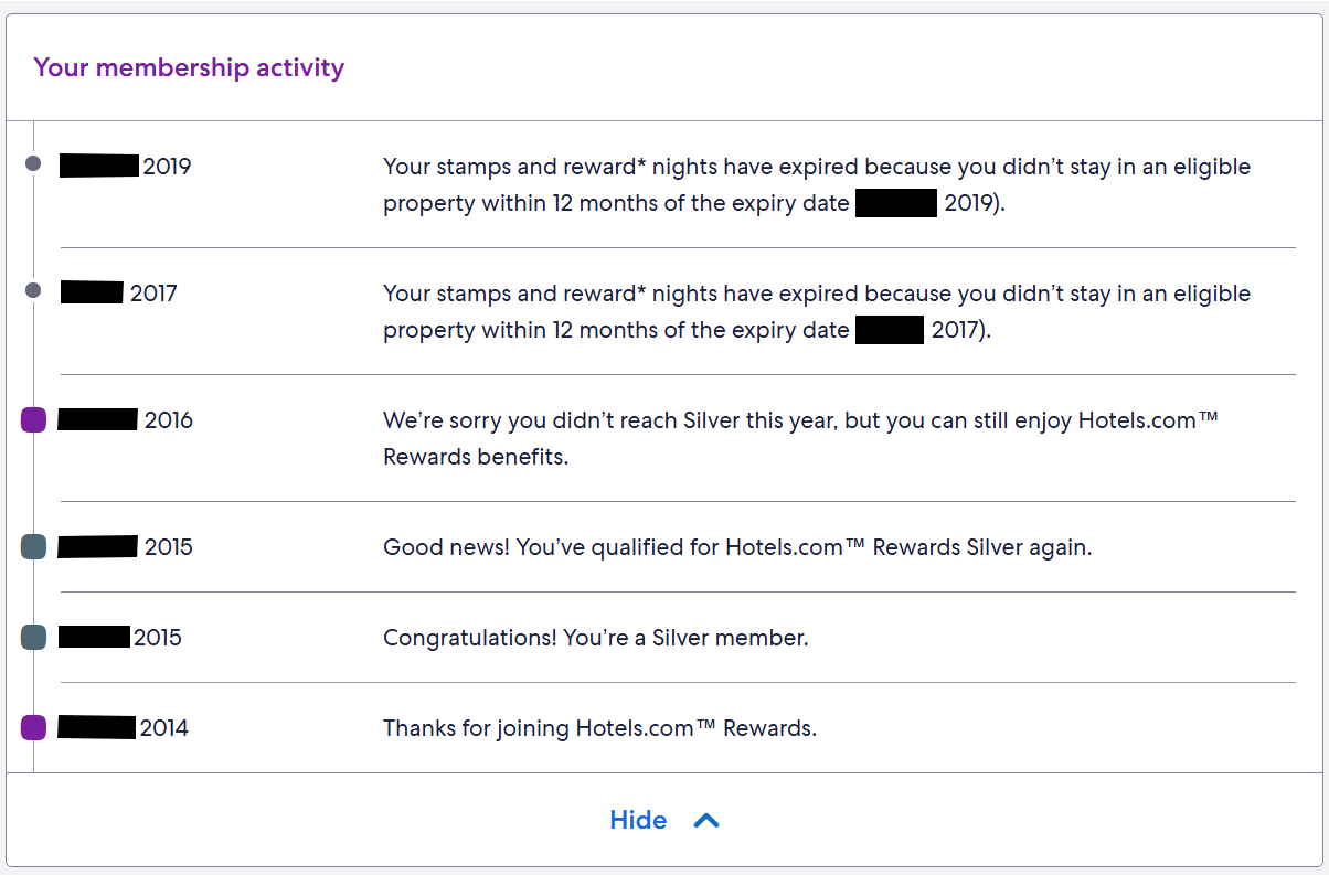
- Membership activity page is easy to understand and useful - no sifting through pages to understand my activity and expirations. Sadly for hotels.com though, I switched to the big chains around 2019 and completely stopped using hotels.com. I value predictable hotel benefits (and money savers) such as breakfast at no extra cost, which is especially important when traveling with family.